So the best way to use this is to scroll up and down and compare the different stages including my reference photo and see the differences and how the stages have been achieved.
I'm concentrating on the leaves here...as this is where the negative painting is used most. (I'll deal with white flowers and those backlit shadows another time. Promise!)
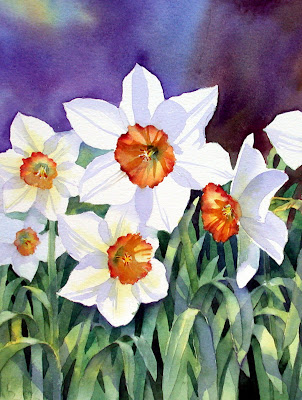
 So how on earth do you paint these flowers and leaves so they look as though they are naturally growing in a garden? How do you get that depth of field? Well its important to OBSERVE, look really carefully at the photo and see how it all works.
 It's a mass of greens but there are different TONES of green there, some almost light yellow, some almost a bluey black.
When you are observing like this it's a good idea to half close your eyes and then you lose some of the colour information and see the tones, the light and dark in a more simplified way.
This also helps you see the scene as a series of SHAPES rather than flowers and leaves.
When I look at the photo with half closed eyes I see different sized rectangles and triangles of tone. Seeing these shapes and trying to copy them will help you with the negative painting technique
 This is the drawing before any paint has been applied. Following the photo, many leaves have been portrayed as turned over towards the viewer. This is very characteristic of daffodil leaves and when they do this, the light falls on them in a distinct way.
 Well you've looked at the reality. Now you have to use the TECHNIQUES, the PLOYS to achieve the natural effect. This basically is a con, a series of tricks! We're painting on a flat piece of paper, but we have to make it look as though it's 3D.
 This is the drawing before any paint has been applied. Following the photo, many leaves have been portrayed as turned over towards the viewer. This is very characteristic of daffodil leaves and when they do this, the light falls on them in a distinct way.
 Look really carefully at the photo to see what I mean. The tops of the leaves are light and the underneath areas are dark. Sometimes between the leaves you can see a distant very dark piece of soil or bark of a tree which is brown /black, sometimes you just see other leaves which are green but a darker tone of green, almost blue.
 Well you've looked at the reality. Now you have to use the TECHNIQUES, the PLOYS to achieve the natural effect. This basically is a con, a series of tricks! We're painting on a flat piece of paper, but we have to make it look as though it's 3D.
A general yellow/green/blue wash has been applied over the leaf area, once again making sure that some of the yellow has been left on the forward facing leaves to denote sunlight.

So after leaving the paint to dry completely, here I have started painting the spaces between the leaves with darker tones of green.

Stage 4 and more detail has been added to the flowers heads. Very little has been added to the leaves at this stage.

Some more of the negative spaces, the spaces between the leaves have been filled in with a darker green wash. See how the yellow from the first wash at the beginning is still visible giving a sense of sunlight hitting the leaves.
 So here you have the finished effect. Look carefully at the leaf area.
This is an important part of the negative painting process as yellow makes the leaves come forward and the blues make things recede. You start to get the depth straight away if you do this.
You don't have to be precise about this, just drop your colours in the general area wet in wet and have faith! The watercolour will spread and end up giving you a natural look. The important thing is not to touch it with your brush. If you start scrubbing the whole effect will be lost. Drop in the colours and leave them be!

I have used variegated washes.
In other words I have dropped in some green and added some blue and then some yellow to make the effect more natural, but the general TONE is darker than the actual leaves. Use plenty of pigment and water with these washes in between the leaves. If you just paint the negative spaces with one dark, flat colour, the effect will not look natural. You are painting a space between the leaves and there is light in there and other leaves behind. There isn't a curtain behind the leaves, it's air and light!


The aim is to achieve a variety of tones in the background, but each getting darker than the leaves in front. If you look back again at the photo, you see that there are lots different tones in the depths between the leaves, not just one dark flat tone.
 So here you have the finished effect. Look carefully at the leaf area.
 The leaves look as though they are one in front of the other.
There are very deep dark areas where there is very little light and there are less dark areas between the leaves denoting other leaves and stalks behind.
The tops of some of the turned over leaves are catching the light and the underneath of these leaves have been darkened. This adds to the sense of depth.
I've also added some cast shadows after studying the reference photo very carefully.
The general effect is I hope convincing and natural looking.


